One year ago today, I launched a little project called ColourLibrary. I launched it with little fanfare, save for a blog post and a few posts on my noew-deleted Instagram, but one year has passed since then. So it might not be a bad idea to revisit it.
What exactly is ColourLibrary?
One of my favourite resources is a site called Brand Colors. I have lost count of how often I’ve opened it and searched for some brand’s colour to use on a project (especially social media outlets). But I found that it lacked a few features. One was that it lacked a few brands, but that’s a case of how frequently they update it and how much time they have to do so. The other was that it only allowed for hexadecimal colours. If someone needed their CMYK, RGB, or other equivalent, they would come away disappointed or need to convert them manually.
And so, the idea for ColourLibrary was born.
One of the reasons to build it was little more than

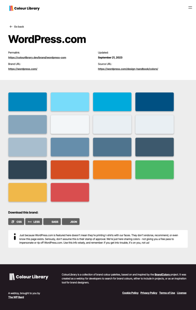
There were features I wanted to build into it from the start, including different colour modes and a back-end management system, and those were built into it. But this would have been the first fully non-WordPress project I had created for public use in some years, so making sure I could do it in the first place was important. Using the tools of my trade, I built a clone of the Brand Colors site and converted the colours listed into RGB, CMYK, and HSL formats. I changed a few things, including adding full-screen colour swatch cards on mobile, and looked back on my work.
What has changed since ColourLibrary launched?
Almost immediately, I started to hate the way the project looked. Mostly because it looked like a straight “Brand Colors” clone. With that, I sat and rebuilt the front-end UI from the ground up, but kept a couple of elements from the original (hello, swatch card, you handsome devil you).


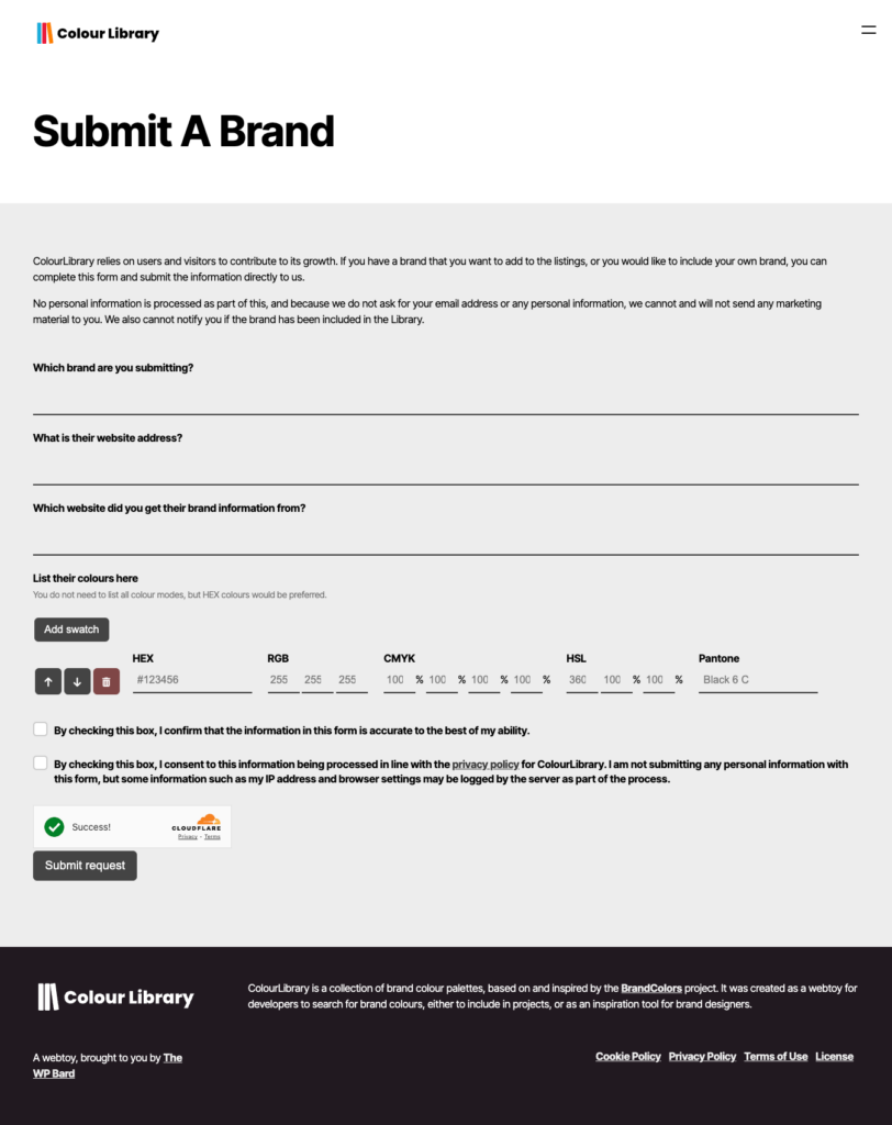
I also built the brand submission form into the site rather than relying on Google Docs, which was both fun and unnerving. But this meant that pushing the brand to the site was a piece of cake.

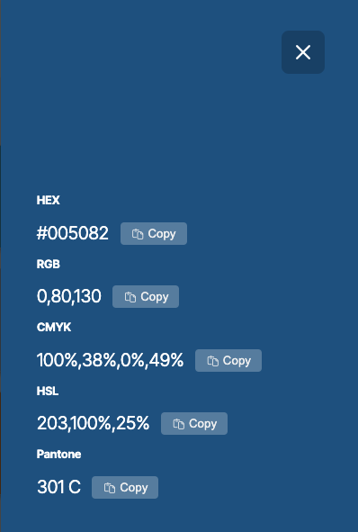
The most recent update added something I have wanted to add for some time – Pantone colours (or a close match, in most cases). Thanks so much to brettapeters on GitHub for the initial Pantone colours list. For reasons that are largely to cover my own arse, I have to say that this project has no affiliation with Pantone LLC or X-Rite and uses the colours from brettapeters in good faith. Where brands have their Pantone colours listed, I have included them rather than relying on the closest match from an algorithm. I am not claiming any responsibility on the accuracy of these colours, and ask that you contact me if there are issues with the brands listed.
There. That’s done.
I have also added a couple of features, primarily push notifications via OneSignal, and fleshed out the back-end management system. You can also check out the ColourLibrary status page, powered by Better Stack, and follow the changelog to see when new updates get pushed.
Honestly, with what I have, I am hugely impressed. Now, this isn’t to say that it’s perfect, not by a long shot. There is a lot that i could do to improve it, but this was one of the first major non-WordPress projects I had built in over a decade. As an example of what is possible, I’m pretty impressed.
So what’s next?
Right now, I’m happy with the project. I wanted to add Pantone references, but that was rolled out in my most recent release. There’s also the possibility of adding reference logos, but that’s likely to get into legal issues, and I have far too much to worry about without getting lawyers involved. Until then. I am always looking for more brands to add. If you wish to be listed, submit your brand on the site. Also, if you have any ideas for new features, I’m always accepting feedback. Email me at [email protected] and I’ll get back to you.

